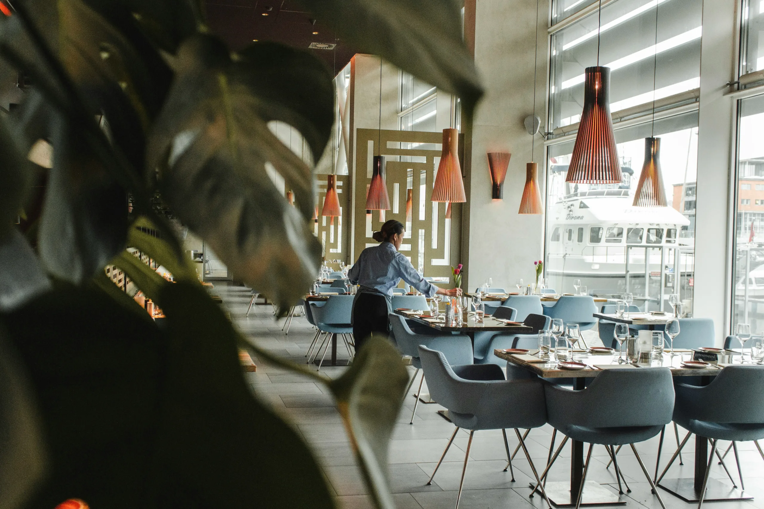
The Psychology of Menu Design in High-End Restaurants
May 31, 2026

You might think fancy restaurant menus are just about listing delicious dishes, but there’s a whole lot more going on behind the scenes. It’s a clever blend of psychology and smart design aimed at subtly guiding your choices and enhancing your dining experience. Let’s dive into how these menus work their magic.
Ever felt like you’re drawn to certain items on a menu, even if you weren’t consciously looking for them? That’s often by design. High-end restaurants meticulously plan their menu layouts to steer your gaze and your appetite.
The Sweet Spot: Where Eyes Naturally Linger
Research in visual attention suggests that people tend to look at menus in a specific pattern. Typically, the top right and top left corners, followed by the center, grab the most attention. Restaurants use this knowledge to their advantage.
The “Golden Triangle” of Temptation
Think of the top right and left corners, and the center of the page, as prime real estate. Restaurants will often place their highest-profit items, or dishes they particularly want to highlight, in these areas. It’s not a coincidence. They’re banking on your eyes landing there first.
The Power of the Anchor Item
Sometimes, a very expensive or unique item is placed at the very top of a section. This “anchor” item can make other, slightly less expensive items appear more reasonably priced by comparison. It’s a subtle psychological trick to make you feel you’re getting a good deal.
The Illusion of Choice: Too Much Can Be Too Much
While variety is good, an overwhelming menu can actually lead to dissatisfaction and indecision. High-end establishments understand this and often curate a select, well-chosen list of offerings.
The “Paradox of Choice” at Play
When faced with too many options, people tend to experience anxiety and may even default to simpler or safer choices, or feel less satisfied with their final decision. A carefully curated menu, on the other hand, can make the decision process feel more manageable and enjoyable.
Focusing on Quality Over Quantity
Instead of a lengthy scroll of every possible variation of a dish, you’ll find a focused selection. This signals confidence on the restaurant’s part – they’re confident that what they offer is superb and that you’ll find something you love within that curated list.
Beyond the Words: The Psychology of Menu Descriptions
It’s not just about what you call a dish; it’s how you describe it. The language used on a menu can evoke emotions, trigger memories, and create desires.
Evoking Sensory Experiences Through Language
The words chosen are crucial. They’re designed to paint a picture in your mind and make your mouth water.
The Power of Adjectives: “Crispy,” “Silky,” “Seared”
Think about the difference between “fried chicken” and “crispy, golden buttermilk fried chicken.” The latter description activates more senses and creates a more appealing image. Words that describe texture, color, sound, and even origin can be incredibly persuasive.
Geographic and Heritage Descriptors: “Tuscan,” “Farm-Fresh,” “Artisanal”
Mentioning the origin of ingredients or the style of preparation adds a layer of authenticity and perceived quality. “Heirloom tomato salad” sounds more appealing than just “tomato salad” because it hints at tradition and superior quality.
Nostalgia and Emotion: Tapping into Memories
Menus can also tap into our emotional connections with food.
“Grandma’s Recipe” or “Classic Comfort”
These phrases tap into fond memories and feelings of warmth and familiarity, making a dish seem more appealing and reassuring. It’s not just food; it’s an experience tied to positive emotions.
The Storytelling Element
Some descriptions go beyond simple ingredients, hinting at the chef’s inspiration or the dish’s journey. This narrative element can make the dining experience feel more personal and engaging.
The Subtle Influence of Pricing: Making Numbers Work for You
The way prices are displayed on a menu can significantly impact how much you perceive as expensive or affordable, and ultimately, what you decide to order.
The Absence of Currency Symbols: Hiding the Cost
You’ll rarely see dollar signs ($) on high-end menus. This isn’t an oversight; it’s intentional.
Removing the “Pain of Paying”
The dollar sign is a direct reminder of spending money, which can trigger a negative emotional response. By omitting it, restaurants aim to reduce the psychological impact of the price, allowing you to focus more on the enjoyment of the food.
Numbers Without Commas or Extra Zeros
Prices are often presented as whole numbers (e.g., 35 instead of $35.00). This small detail makes the price seem lower and less precise, thus less impactful.
Anchoring and Contrast: Playing with Perceived Value
As mentioned earlier, the placement and presentation of prices play a critical role.
High-End Anchors for Value
Placing a very expensive item at the top of a category can make other items seem more reasonably priced in comparison. It sets a mental benchmark.
Bundling and Set Menus: Offering Perceived Savings
Prix fixe menus or chef’s tasting menus offer a pre-selected combination of dishes at a set price. This simplifies decision-making and often provides a sense of getting more for your money, even if the total cost is higher than ordering à la carte.


Menu Design Elements: Beyond the Words and Prices
The visual aspects of a menu – its size, color, font, and overall aesthetic – are just as important as the content.
The Impact of Color: What Hues Evoke What Feelings
Color psychology is a powerful tool, and menu designers use it deliberately.
Red and Yellow: Appetite Stimulators
These colors are known to stimulate appetite and create a sense of urgency. While less common as dominant colors in high-end menus, they might be used as accent colors.
Green and Blue: Calming and Sophisticated
Greens and blues can evoke feelings of freshness, nature, and tranquility, aligning with a sophisticated dining experience. However, overuse can sometimes suppress appetite.
Neutrals: Elegance and Seriousness
Off-whites, creams, and grays are often used in high-end establishments to convey sophistication, elegance, and a focus on the food itself.
Font Choices: Legibility Meets Sophistication
The type of font used communicates a lot about the restaurant’s brand and the dining experience.
Easy to Read, Yet Stylish
Fonts need to be legible, especially for diners who might be in lower light conditions. However, they also need to reflect the restaurant’s overall aesthetic – whether it’s classic, modern, or avant-garde.
Limiting Font Variety
Using too many different fonts can make a menu look cluttered and unprofessional. Typically, two or three complementary fonts are used for headings, descriptions, and prices.
Paper Quality and Finish: The Tactile Experience
The physical feel of a menu is part of the sensory journey.
Weight and Texture
A heavy, textured paper stock generally feels more luxurious and substantial than thin, glossy paper. It conveys a sense of quality and attention to detail, preparing you for the high-quality food to come.
Lamination and Sleeves
While sometimes used for durability, overly shiny lamination can sometimes detract from the sophisticated feel of a high-end menu. A matte finish or high-quality cardstock often feels more premium.
Menu Engineering: The Data-Driven Approach to Profitability
Restaurants don’t just wing it when it comes to their menus. They use “menu engineering,” a practice that analyzes sales data to identify profitable items and strategically place them on the menu.
Identifying Your “Stars,” “Plowhorses,” “Puzzles,” and “Dogs”
Menu engineering categorizes dishes based on their popularity and profitability.
Stars: High Popularity, High Profitability
These are the dishes you want to showcase and push. They’re popular and make the restaurant good money, so they’re often placed in visually prominent locations.
Plowhorses: High Popularity, Low Profitability
These dishes are very popular but don’t make as much profit. Restaurants might slightly increase their price or use them to fill out the menu, encouraging diners to trade up to a “Star.”
Puzzles: Low Popularity, High Profitability
These are dishes that are profitable but not selling well. The restaurant might redesign their description, move them to a more prominent spot, or suggest them to diners.
Dogs: Low Popularity, Low Profitability
These are the dishes that aren’t selling and aren’t profitable. They might be removed from the menu, or their ingredients might be repurposed for more profitable dishes.
Strategic Placement for Profit
Menu engineering directly influences where items are placed.
Prominently Displaying Stars
Your “stars” will often be found in those coveted “sweet spot” locations we discussed earlier. This isn’t accidental; it’s a calculated move to maximize their sales.
Hiding the Dogs
Conversely, less profitable or unpopular items might be placed in less visible areas, or not featured at all, to subtly discourage ordering them.
By understanding these psychological principles and design tactics, you can appreciate that the menu at a high-end restaurant is more than just a list of food; it’s a carefully crafted tool designed to enhance your experience and, of course, ensure the restaurant does well.